How to translate websites. Episode 2: Button names
First of all: Happy International Translation Day to all my colleagues! It’s a perfect time to continue with the next episode of How to Translate Websites. In this post let’s have a look at button names placed within menus or in the page content.
View it online
Buttons used on websites have a defined purpose and functionality. They arethere to complete a certain action (e.g. ‘Cancel’, ‘Submit’) or link to another page (e.g. ‘Go back’, ‘Next’). To ensure user-friendliness, text strings placed on buttons are usually short and displayed in a bigger font than other strings on the page. Buttons may appear in all kinds of shapes, colours and sizes, depending on the website design and button name. What’s more, the colours and sizes may change once you click or hover on the button. It’s also quite common to use pictures or animations instead of a simple text.
How does it all relate to translation? Well, for a start you’ll need to view the button online to find out how it functions and how it’s designed. If you fail to do it, you may end up with misleading translations or menu items that are not related to the linked content.
Keep it short and functional
Once you know how the button works, you can go ahead and translate its name. Not only text matters here, all the extra functions may be relevant, too. For example, if the button changes its size when you click on it, you’ll have to come up with a shorter text, so that all characters are visible. Or, if the button changes its colours, you might want to check if the colours are appropriate for your target audience. The same applies for pictures used as buttons. Some images may include cultural elements that have to be localised or display items that won’t be clear to your target users. You can then advise your customer or website developers on other images or colours that will work better in the localised version.
Add an extra touch
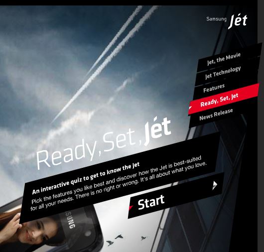
Similarly to error messages described here, some buttons have a creative and non-standard design. Funny phrases, word puns or animations used as a button name might be a bit more challenging to localise. In case of animations it might be necessary to work on another file formats, e.g. Adobe Flash to translate the strings. Below you can find examples of creative or animated buttons found online:

Sensisoft: animations, images and original fonts

Samsung Jet: creative button name and animations
Although translation of button names may seem to be straightforward, in some cases you’ll need to come up with creative solutions to preserve the same style. The functionality of buttons has to be clear to your target user and you’ll need to adhere to character restrictions, even if it means rephrasing or abbreviating the button name. Either method you choose, have fun and keep it short!
Do you want to learn more how to translate and localise websites? Check out my online course How to translate and localise websites!


