How to translate websites. Episode 1: Non-standard error messages
In the new series of How to Translate Websites, which is an extension of my course on website localisation, I’ll share practical tips for successful translation and localisation of the online content. The first post deals with creative and non-standard messages that show up when an error occurs. Let’s get started!
Why non-standard?
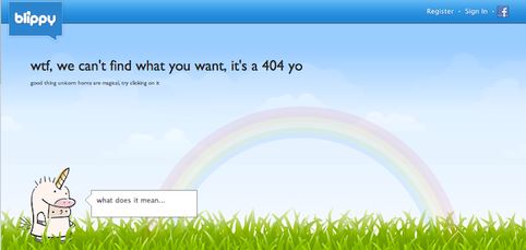
A typical error message displayed on a website reads: ‘The webpage cannot be found’, ‘That webpage no longer exists’ or ‘The website cannot display the page’, sometimes followed by the error number (e.g. 404). Although these errors might be a real hassle for users and developers, they usually don’t pose any challenge for translators. When it comes to the text itself, nothing can go wrong. As simple as it gets. But some developers go the extra mile to make their products unique and to entertain the users. They spice up their messages with jokes, word puns, funny images, cultural references, just about anything to make you smile and relax. A good example can be an error message displayed on Mint.com or Blippy.

Why errors?
Now, why translate and localise error messages? It’s the same type of content as any other text you’d find online. The only difference is that you can see it only under certain circumstances that don’t occur often (depending on the website, of course). Also, it might be difficult to foresee at what time an error message will appear. If it’s particularly funny, there’s nothing really you can do to see it again at a later time. Apart from waiting for another error. And this may pose
a challenge for a translator who refers to the online content when localising and translating websites.

View it and make it fun
Especially in the case of non-standard error messages, a number of screenshots may come in handy. With a good reference material you’ll be able to see the context, images and any other visual elements. Every little item may be significant here. Once you have access to the actual error message, you can work on a creative version for your target users. Oftentimes you’ll need to transcreate
the content, add some jokes, change character names or use powerful word puns. But don’t limit your efforts to the translation of the text only. The image plays an important role, too. If it bears any cultural references, you may want to inform your customer that e.g. a new graphic is needed to find a better match for your transcreated message. In some cases colours and symbols used on the error screen might be inappropriate for your audience. Then you can advise the website developers what visuals would be more suitable for the target users of the localised version.
Although error messages form only a minor part of the localised website content, you’ll need to analyse and consider every element of the non-standard message. That’s how you can evoke similar emotions (be it laugh, excitement, disappointment) of your target audience and ensure that the message is fully understandable.
Do you want to learn more how to translate and localise websites? Check out my online course How to translate and localise websites!


